Quote:
Originally Posted by xmas

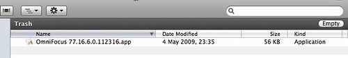
As a reference, take a look at the Trash window in Finder... (and a few other places as well, like shared folders, I think)
|
Ah. I begin to see how things went wrong.
The high contrast bar on the Finder Trash window is a loud traffic alert - a warning that this is an exceptional folder. A warning against, for example, trying to open the files that you see.
This illustrates the limitations of simply looking around for precedents, without enough theorization of how graphic design actually functions.
Ironically, even the loud warning bar of the Trash Finder, with its two large parallel high-contrast edges, is nothing like as noisy and distracting as the wild zebra of the current 1.7 filter panel.
In most vertical sections, the filter panel now has not 2 but 4 high-contrast horizontal edges to over-stimulate the retina, plus a complexity of bright text edges which do the same.
(Suitable for an exceptional warning against walking over a cliff, when attention really does need to be distracted, but not a helpful signal-to-noise ratio for an ordinary working resource, when users are just trying to concentrate and get things done).
It's not enough to choose a fill - you have to manage the edges which that fill creates. The levels of retinal stimulus created by those edges (the levels of contrast) need to match the urgency of the signal that you wish to convey.
Apple's designers manage contrast quite carefully - that is why they chose strong contrasts to draw attention to the exceptional status of the Trash folder - Omni's designers also need to make the shift from just choosing fills to deploying contrasts judiciously.
--