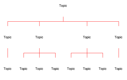
Perhaps this is the clearest illustration of buggy or dysfunctional output from automatic layout that I have seen.
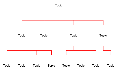
Here is a simple and symmetrical outline structure easily grasped at a glance:
What does
automatic layout do with it ?
- The symmetry of our data is concealed. Automatic layout misrepresents it as asymmetrical.
- Our clear and simple data becomes ambiguous. In fact, frankly unintelligible. Whose children are whose ?
- Unnecessary cognitive noise is introduced. Where we should have simple straight lines, to the left and right, we have distracting dog-legs, with two redundant corners each.
(For any philologists out there, this is known, in Oxford English, as a 'dog's breakfast').
Not sure if this is a bug report:
"Automatic layout introduces spurious asymmetries, ambiguities and distractions."
or a feature request:
"Plain vanilla orthogonal layouts (parents centered over child ranges) for nested structures, please."
Perhaps both ?
--