Wondering if this asymmetric and unreadable result of automatic layout was a quirk of a particular template, size or object spacing, I went to Omni's own gallery.
The foregrounded example, in position of honour at number one in the
marketing material (available in the
sample documents package) does show an awareness that users will need and expect a simple orthogonal layout of their outlines. And the example shown seems to promise reassuring symmetry and simplicity and readability. Just the kind of thing you would expect from an Automatic Layout function.
Foobar Inc are at first well-satisfied with their choice of OmniGraffle for their
organisation chart.
Soon, however, the company reorganises a little. They go for a slightly flatter organisational structure, they promote one colleague, but also prune the payroll a little not entirely unheard of ...
They return to OmniGraffle 5, update their outline, and click
Automatic Layout. They are expecting this:
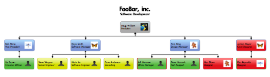
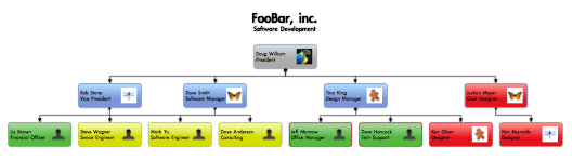
In fact, they get something asymmetrical and misleading, or at best, uninterpretable. Who reports to who at bottom left ?
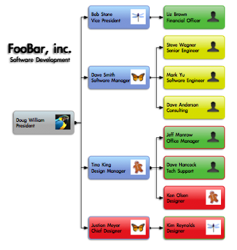
Perhaps they have run into a one-off glitch ... The diagram is a bit wide anyway. Let's choose a left-to-right direction. Now what they are expecting is this:
What
Automatic Layout actually produces is this:
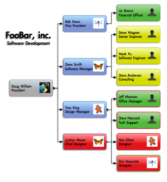 Still
Still oddly asymmetrical and messed up at the bottom ...
Omni's foregrounded gallery example gives the impression of offering clear, simple and symmetrical tree orthogonal layouts with parents centered over children. Clearly Omni knows that this is what people need and expect. Is this, in fact, what was intended by design ?
If so, there seems to be a structural clash between the design specifications and the actual capacities of the trumpeted 'underlying engine'.
If not, is there not a risk that the symmetry and clarity of the example given pride of place in the gallery might be a bit misleading ?
--