
Quote:
|
Originally Posted by Jay Levitt

Well, after 24 hours, I've stopped noticing the bizarre contrast
|
 |
|
These forums are now read-only. Please visit our new forums to participate in discussion. A new account will be required to post in the new forums. For more info on the switch, see this post. Thank you!
|
|
| FAQ | Members List | Calendar | Today's Posts | Search |
| Aesthetics of the New Filter Bar | Thread Tools | Search this Thread | Display Modes |
|
Member
2009-08-29, 05:02 PM
Quote:
Post 31
|
|
Member
2009-08-29, 05:57 PM
My vote is for the new View bar (despite my absolute respect for Tufte); but strangely enough, I haven't noticed any change of font (for either tasks or project bar)?
Post 32
|
|
Member
2009-08-29, 06:39 PM
Quote:
Post 33
|
|
Guest
2009-08-30, 01:44 AM
Quote:
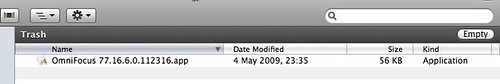 Ah. I begin to see how things went wrong. The high contrast bar on the Finder Trash window is a loud traffic alert - a warning that this is an exceptional folder. A warning against, for example, trying to open the files that you see. This illustrates the limitations of simply looking around for precedents, without enough theorization of how graphic design actually functions. Ironically, even the loud warning bar of the Trash Finder, with its two large parallel high-contrast edges, is nothing like as noisy and distracting as the wild zebra of the current 1.7 filter panel. In most vertical sections, the filter panel now has not 2 but 4 high-contrast horizontal edges to over-stimulate the retina, plus a complexity of bright text edges which do the same. (Suitable for an exceptional warning against walking over a cliff, when attention really does need to be distracted, but not a helpful signal-to-noise ratio for an ordinary working resource, when users are just trying to concentrate and get things done). It's not enough to choose a fill - you have to manage the edges which that fill creates. The levels of retinal stimulus created by those edges (the levels of contrast) need to match the urgency of the signal that you wish to convey. Apple's designers manage contrast quite carefully - that is why they chose strong contrasts to draw attention to the exceptional status of the Trash folder - Omni's designers also need to make the shift from just choosing fills to deploying contrasts judiciously. -- Last edited by RobTrew; 2009-08-30 at 03:59 AM..
Post 34
|
|
Member
2009-08-30, 04:45 AM
Quote:
@Xmas: I'm sure there are precedents for every design decision in OmniFocus. But unless you know the context in which they were designed - and unless you have a cohesive design concept for OF itself - you don't know if they fit. Design elements make lousy existence proofs. As Rob points out, you've taken an element that was explicitly designed to upstage the window and grab our attention, and reused it in a context where it should fade into the background. If you practice design-by-empirical-example, you'll also run into the combined resource constraints of every Mac development shop. Maybe this checkbox over here was added as a last-minute fix; maybe that graphic was supposed to be temporary but their designer broke his arm. Again: you need context. Why did that designer make that choice in that application? I'll even walk back from my agreement on the old view bar. Yes, from a programming standpoint, it conflates data type with data value. And for 20 years, I've railed against exactly those category errors. But the iPhone has proven me wrong; there are plenty of Apple-designed controls that don't behave like a database field. And that turns out to be fine - great, even - because users don't have mental database models (unless they're programmers). They have mental models, sure. But that model's closer to "when I click 'today', I see today's tasks" than "when I click 'today', OF selects all rows whose date value is within 24 hours". That's why you rarely see Mac or iPhone apps that display a "list" with only one result. If there's only one result, just take me to the result! It's not what my left brain expects from a database, but it's what my right brain is waiting to see. Behaving like a strongly-typed database IS the category error; it's a layering violation, a leaky abstraction. Your object model and data structures should be completely hidden by the application. If the view bar was confusing, the solution isn't to get analytical, double the size of the view bar, and explain everything in text; the solution is to make it LESS analytical and more intuitive. Anyway... I'm no designer, but I know it when I see it, and I don't see it. I think what OF lacks is a cohesive design aesthetic and metaphor.
Post 35
|
|
Member
2009-09-01, 09:06 AM
I have less issue with the style than the loss of vertical space.
Hopefully a future update will allow disabling the labels. For now I keep view bar hidden where before I did not. -P
Post 36
|
|
Member
2009-09-01, 01:08 PM
Quote:
Open a Finder window and press [cmd]-[F] to see a filter bar. Omni, you gotta do something about this mess. Now. My eyes hurt.
Post 37
|
|
Member
2009-09-05, 12:53 PM
I have to agree on the distracting nature of the darkness of the new filter bar. I like the description but the entire thing needs to be much lighter or give us a way to change it. I tried the 1.6 theme and it didn't fix this at all.
WHy did you make it so darned dark? Couldn't you have just added the description text in a nice light unobtrusive way?
Post 38
|
|
Member
2009-09-05, 03:03 PM
Quote:
I like it!! But hey if others don't put an option in there to have either one : )
Post 39
|
|
Omni

2009-09-06, 09:40 AM
Sorry for the quiet on our end, everyone. We're certainly listening to your feedback on the view bar interface, but since releasing 1.7 we've been more focused on perspective regressions (1.7.1), crash fixes (1.7.2), and sync issues (the upcoming 1.7.3). We plan to do some more interface work soon after that.
Post 40
|
|
|
 Similar Threads
|
||||
| Thread | Thread Starter | Forum | Replies | Last Post |
| iPad Aesthetics :-( | moons | OmniFocus for iPad | 4 | 2010-10-08 05:53 AM |
| Filter Bar (Again) | ricot | OmniFocus 1 for Mac | 2 | 2010-02-21 01:18 AM |
| Omnifocus Interface Aesthetics/ Visual Design | uxable | OmniFocus 1 for Mac | 25 | 2009-09-28 01:38 AM |
| filter by 'due soon' | markbrown00 | OmniFocus 1 for Mac | 2 | 2007-11-17 02:01 PM |
| Sort filter + Next filter + repetitive actions | santra | OmniFocus 1 for Mac | 4 | 2007-10-28 12:28 PM |
 Linear Mode
