

Take a look at this screenshot:
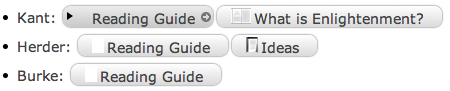
Don't the attachment boxes just look wrong? Neither the text nor the preview icon are properly centred, and the boxes generally seem a tad too big. For such an otherwise meticulously designed application, this awkwardness is a bit bizarre. Does anyone know how to make attachment boxes look nicer (besides just using the default Helvetica 12 font)? I've fiddled around a bit but there doesn't seem to be any obvious way to style them.
I realize the inherent nitpickiness in this issue, but hey, we're on an internet forum discussing an outlining application, cut me some slack :).
P.S. 3rd year political philosophy: it sounds like a fun class until you have to write an essay on actuality and rationality.
 Linear Mode

